

Natural Sensations had operated on SFSU's campus since 1986. Smoothies, açaí bowls, bagels, salads — a genuinely good offering.
But the brand told none of that story.
The signage had been patched together over decades. The colors conflicted. The logo had evolved without ever resolving. There was no system, no throughline, nothing that connected the cart to the tuktuk to the storefront. Students making a split-second lunch decision walked past Natural Sensations for vendors they could instantly read.
A 30-year campus institution was invisible by design.

The research phase — conducted collaboratively — made one thing clear: students and staff who knew Natural Sensations were genuinely attached to it. The problem wasn't the product or the people. It was that nothing on the outside communicated what was on the inside.
A street cart. Fresh fruit.
A campus corner that became a community fixture. That origin story was worth telling — and it had never been told visually.
The brief wasn't to invent a brand. It was to finally show the one that had always been there.
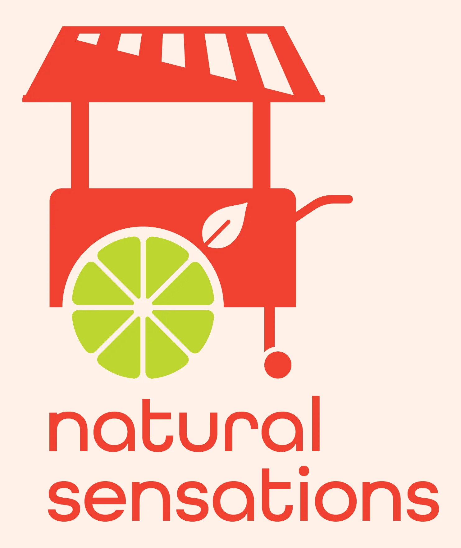
Natural Sensations started as a fruit cart: it's their origin story.
The wheel of the cart is a citrus slice — nodding directly to the smoothies and fresh fruit that built the business. A leaf is punched out of the cart body, signaling the healthy add-ins (spinach, kale, spirulina) that differentiate their menu.
Every element earns its place. Nothing is decorative.

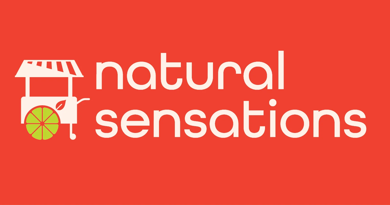
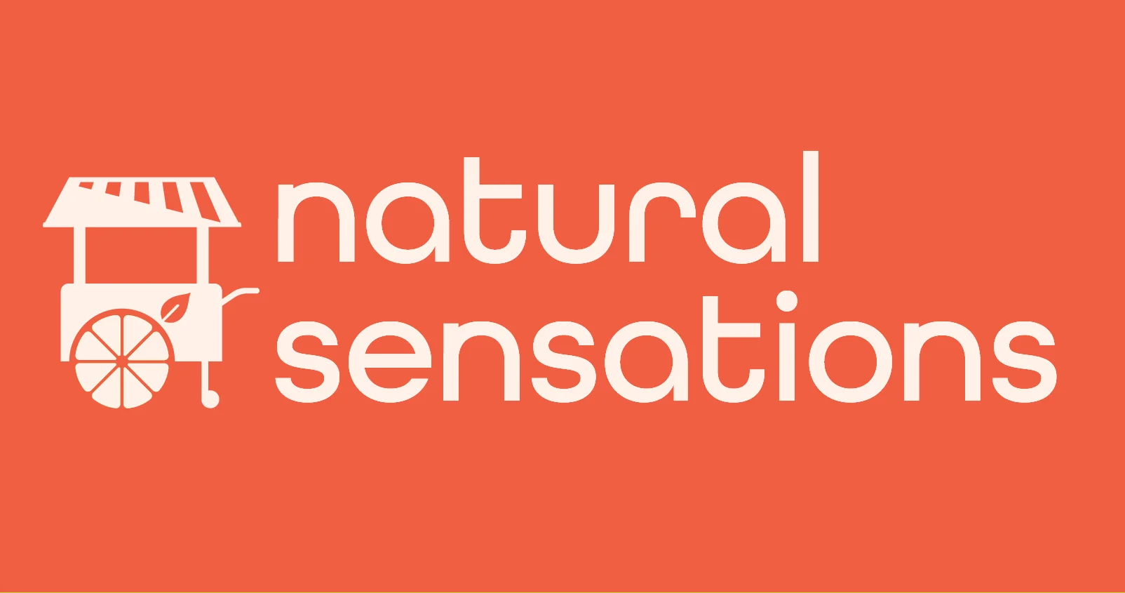
The badge wasn't built to work everywhere, so Natural Sensations needed a suite of lockups that would meet their needs.
Vertical, horizontal, wordmark, as well as multiple symbol-only forms were built for their system


The mark holds across every background in the system.

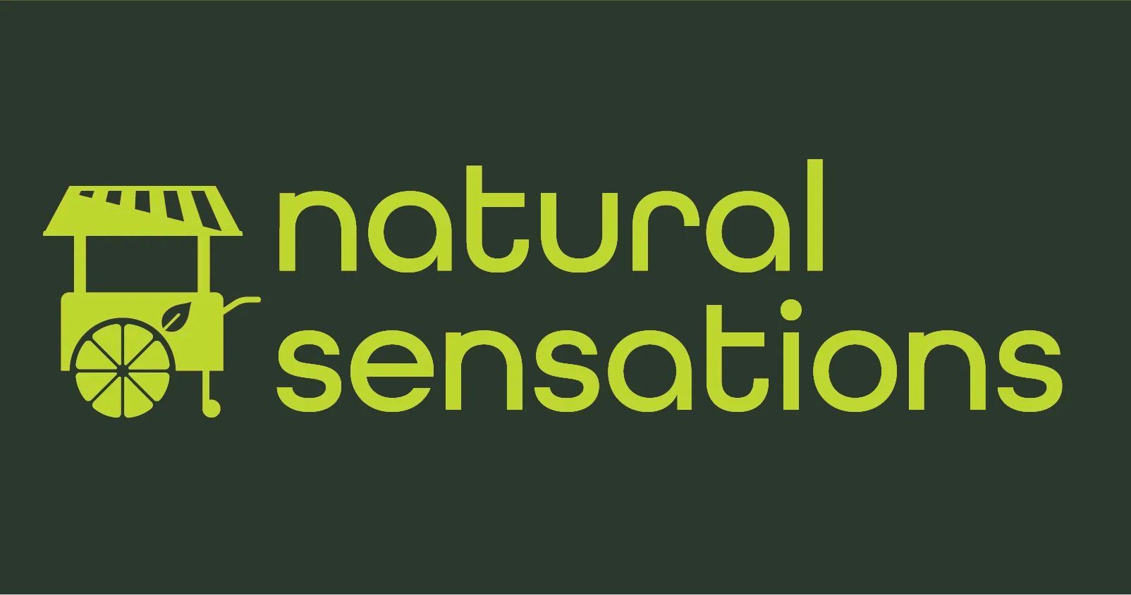
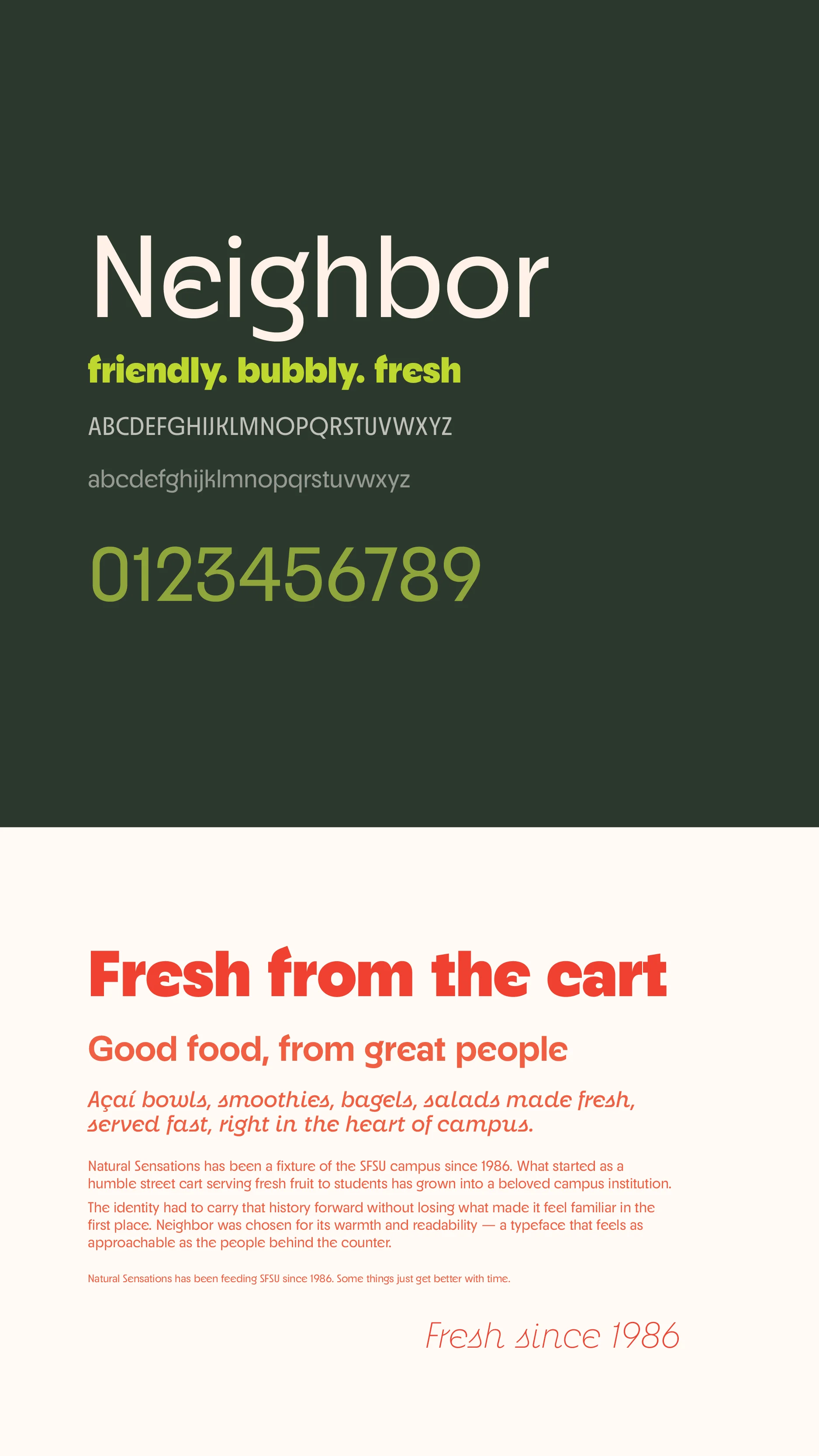
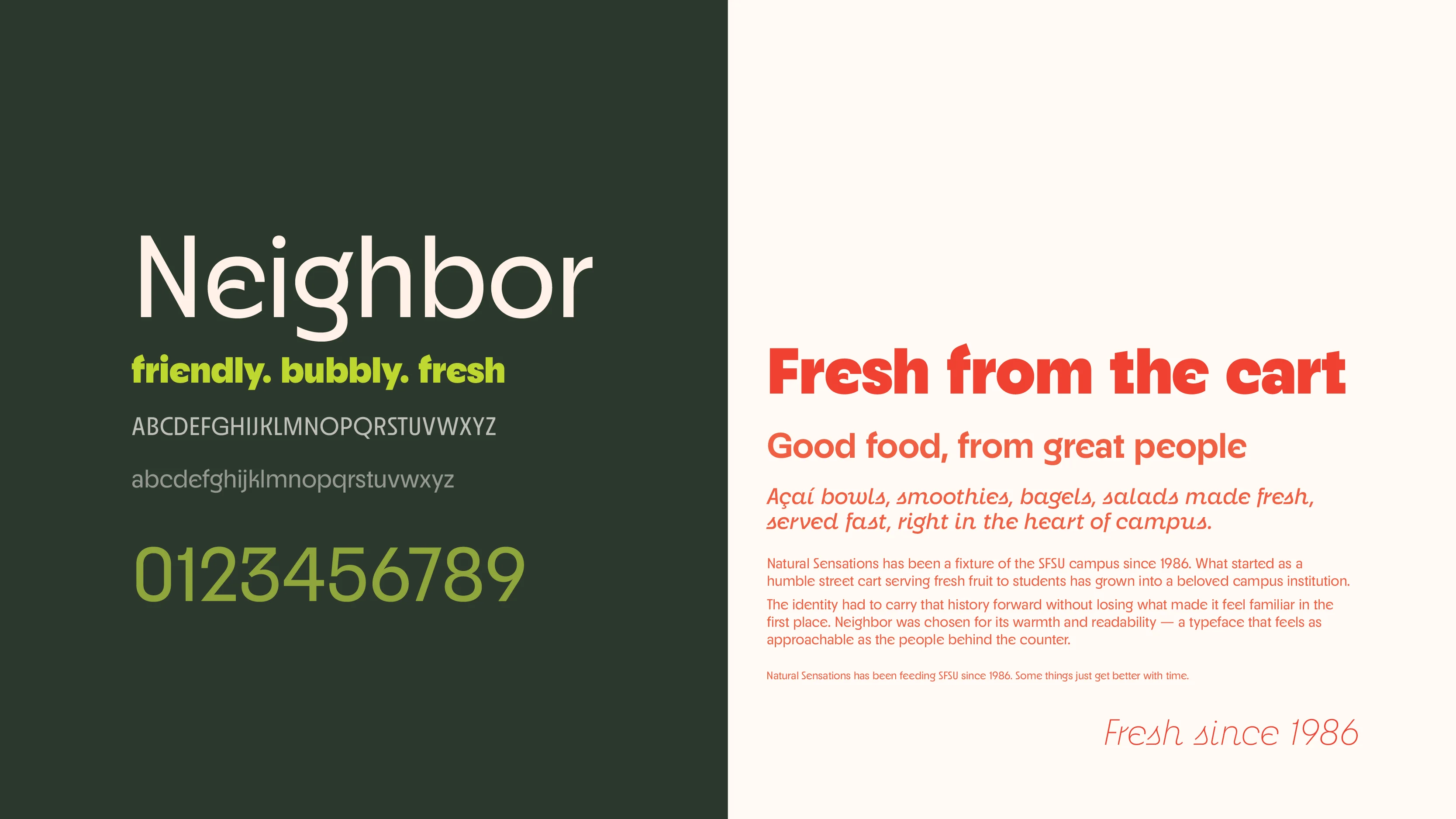
The palette is pulled directly from the menu.
Market Red sets the tone: warm, energetic, and immediately associated with appetite and freshness. Lime Green provides the contrast that makes the system pop. Comfort Cream keeps everything warm rather than clinical.
The extended palette adds depth: Avocado Green and Kale Green ground the system in nature, while Faded Memory Red and Almond White give it room to breathe across surfaces.
These are the colors that are inspired by what's in the blender at Natural Sensations.
Market Red
Lime Green
Comfort Cream
Faded Memory Red
Avocado Green
Kale Green
Almond White
Neighbor (Adobe Fonts) is the brand typeface. Rounded, warm, and immediately readable — it sits in the same territory as the brand's personality: approachable without being juvenile, enthusiastic and friendly like the best neighbors.
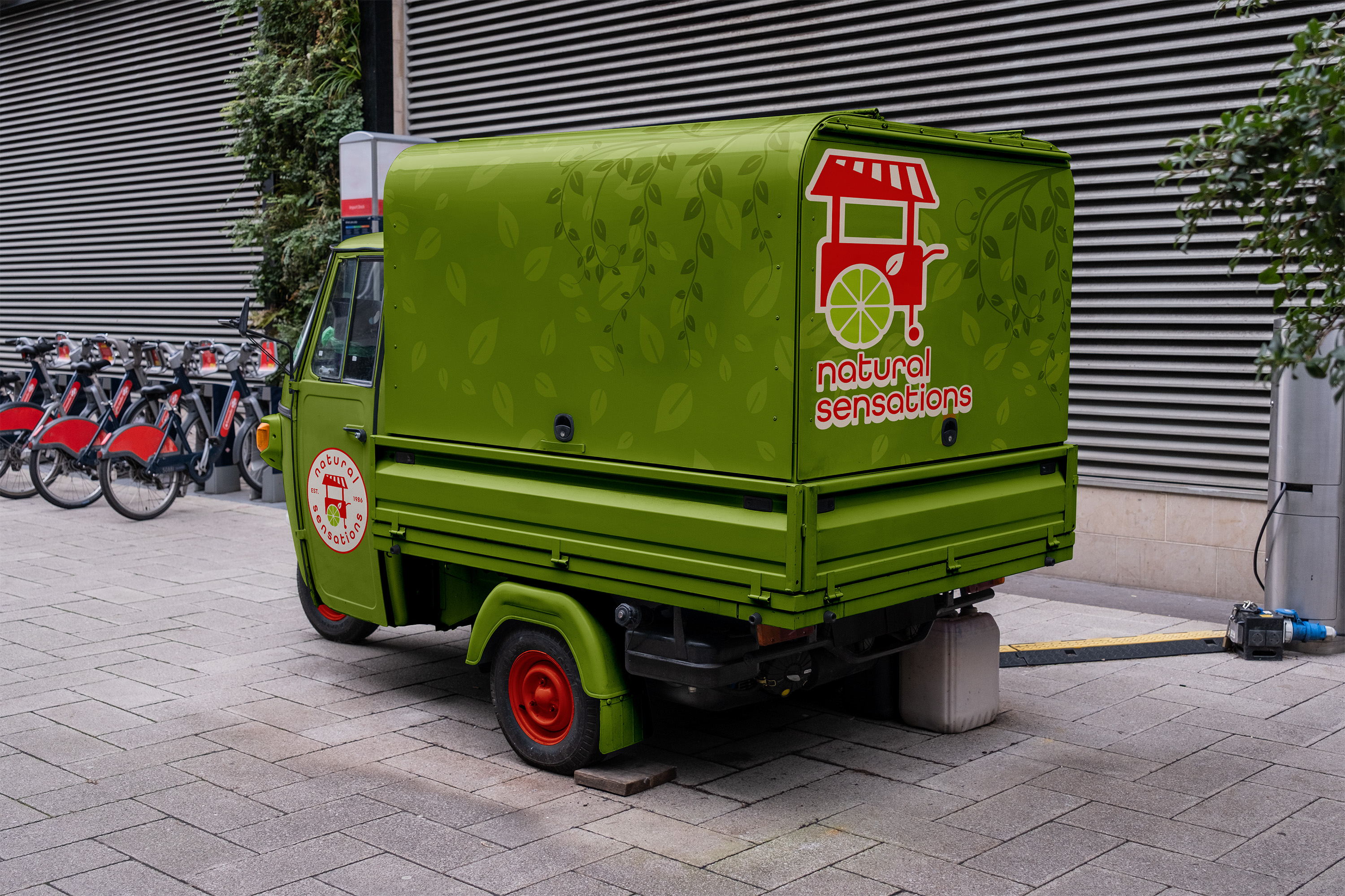
The tuktuk is Natural Sensations' most visible asset — and soon its most mobile one. The owner is expanding back into mobile service, with plans to bring the brand to SFSU's farmer's market and eventually across San Francisco.
The wrap needed to work as a moving billboard. Green dominates, the leaf vine pattern adds depth, and the badge logo holds its own at full vehicle scale.
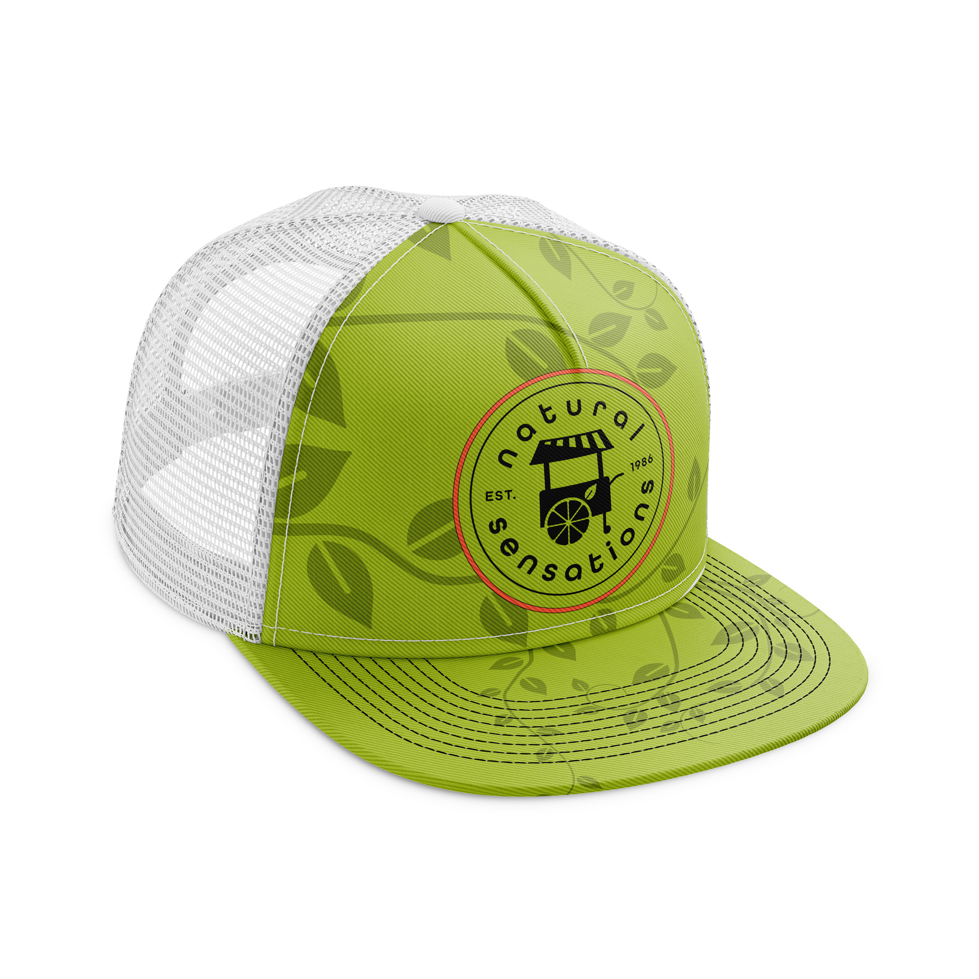

Hats in recycled materials and earth-friendly dyes. Aprons in organic cotton with the brand's natural color palette.
A callback to the street cart origins and perfect utility for smoothie making
Recycled kraft paper bags with earth-friendly pigments. The vine and leaf motif wraps the bag in the same botanical language as the brand system. Bright red carry handles pop against the natural paper stock.
The packaging extends the identity into every customer's hands — and across campus.


SFSU students commute. The campaign meets them at the bus stop before they reach campus — logo-forward, menu-forward, with a directional arrow pointing straight to the storefront.
Simple enough to read in two seconds. Distinct enough to remember.
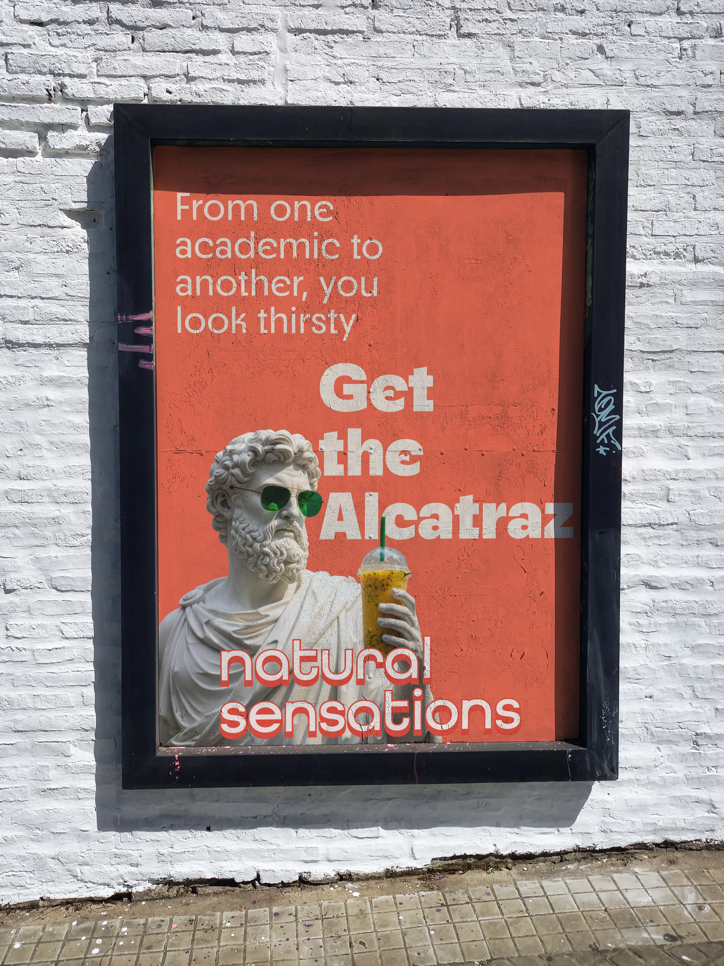
With the brand system established, the next challenge was product-level. The Alcatraz Smoothie, Natural Sensations' top seller, needed its own campaign. The goal was to build a full funnel social strategy that could move a student from zero awareness to a habitual purchase.
Stage 0: Discovery
Plant the craving before they're anywhere near the vendor. Campus chokepoints. Pure product. "Inescapably good."
Stage 1: Awareness
Stop the scroll. Name the product. The statue character introduces the Alcatraz with personality. "From one academic to another, you look thirsty."
Stage 2: Consideration
Remove friction. Give them a reason to go now. Location, product name, nothing else. "The Alcatraz Smoothie. SFSU Student Center."
Stage 3: Revisit
Build the habit. Reward the choice they already made. Insider language for returning customers. "Same time tomorrow?"

The brand system was presented directly to the owner. They chose to implement the unification of the identity using my system alongside their existing logo — a real-world decision that speaks to how brand adoption actually works.
The result: a 12% lift in their core product sales.
A unified identity didn't just make them look better: it made them the easy better choice.
