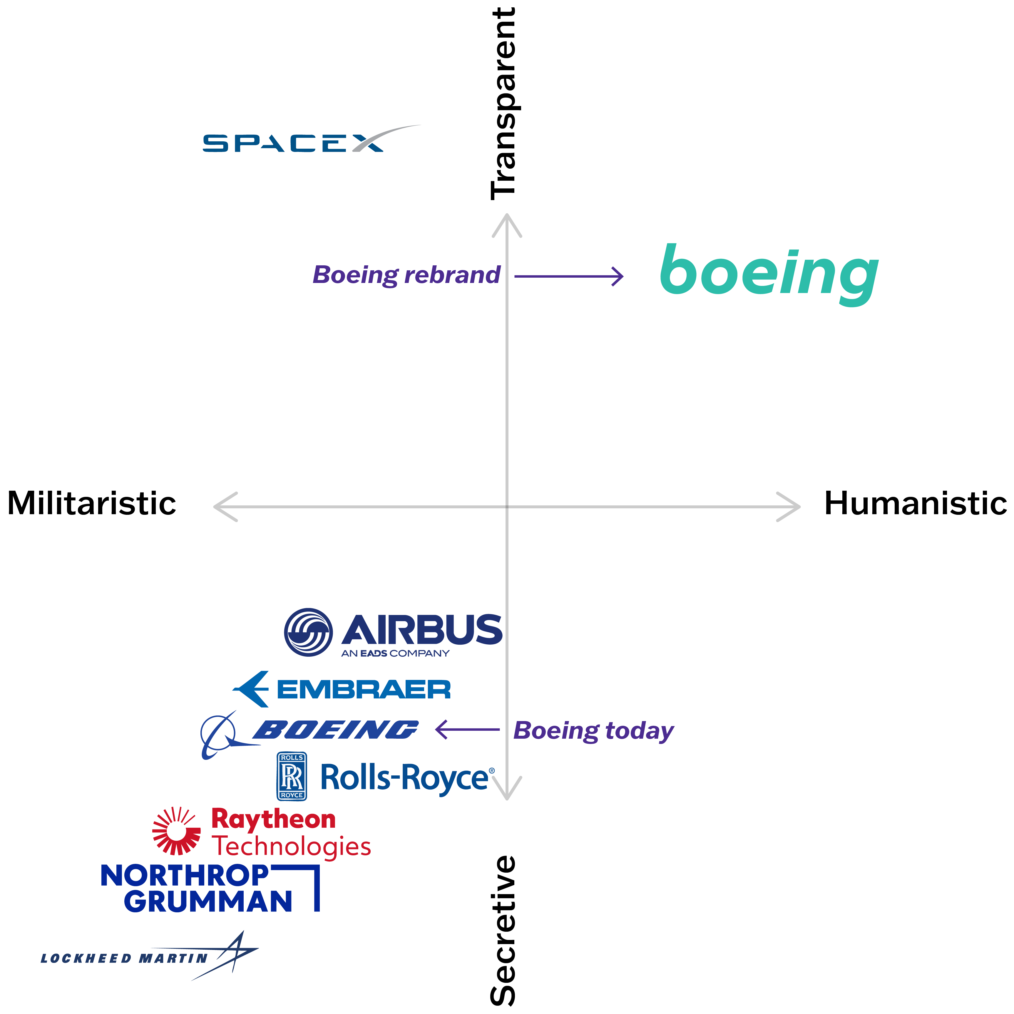
Boeing is one of the most recognized brands on earth. It is also one of the most damaged. Its identity was frozen. Formal. Defensive. Opaque.


Every competitor uses blue.
Every competitor shows products, not people. Every competitor claims transparency in language that reads like a compliance document.
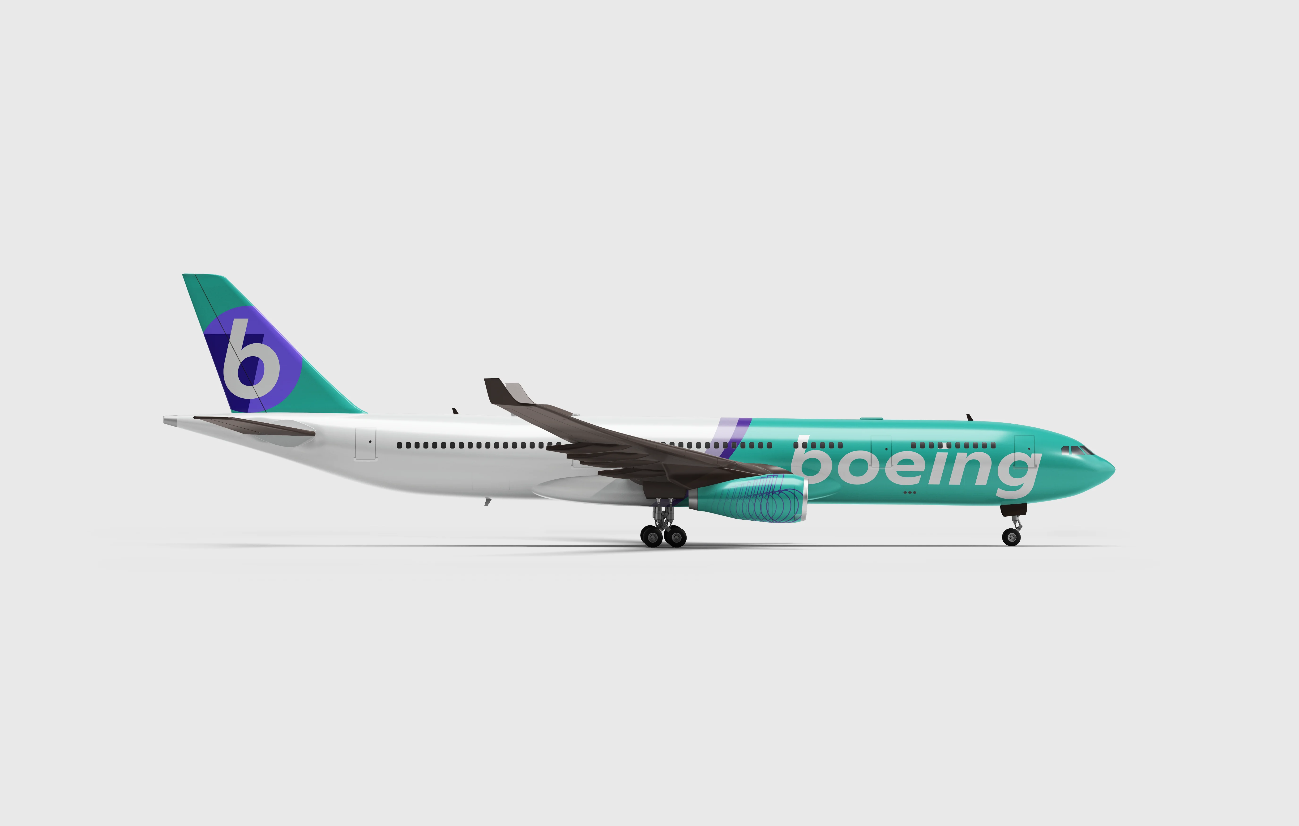
The wordmark is set in a custom typeface, redrawn to carry the weight of a brand in transition. Bold enough to command attention. Lowercase to signal approachability. Boeing has earned its place in aviation history.
Liberty Teal takes its name from a monument that has welcomed the world for over a century. Boeing is an American institution of the same weight. Its colour should carry the same meaning.
The supporting palette traces a journey upward from the streets of Seattle, through the clouds, all the way to the Kármán Line.
At the edge of space where Boeing has always looked.
Liberty teal
Kármán Line Indigo
Deep Indigo
Platinum Grey
Graphite Carbon
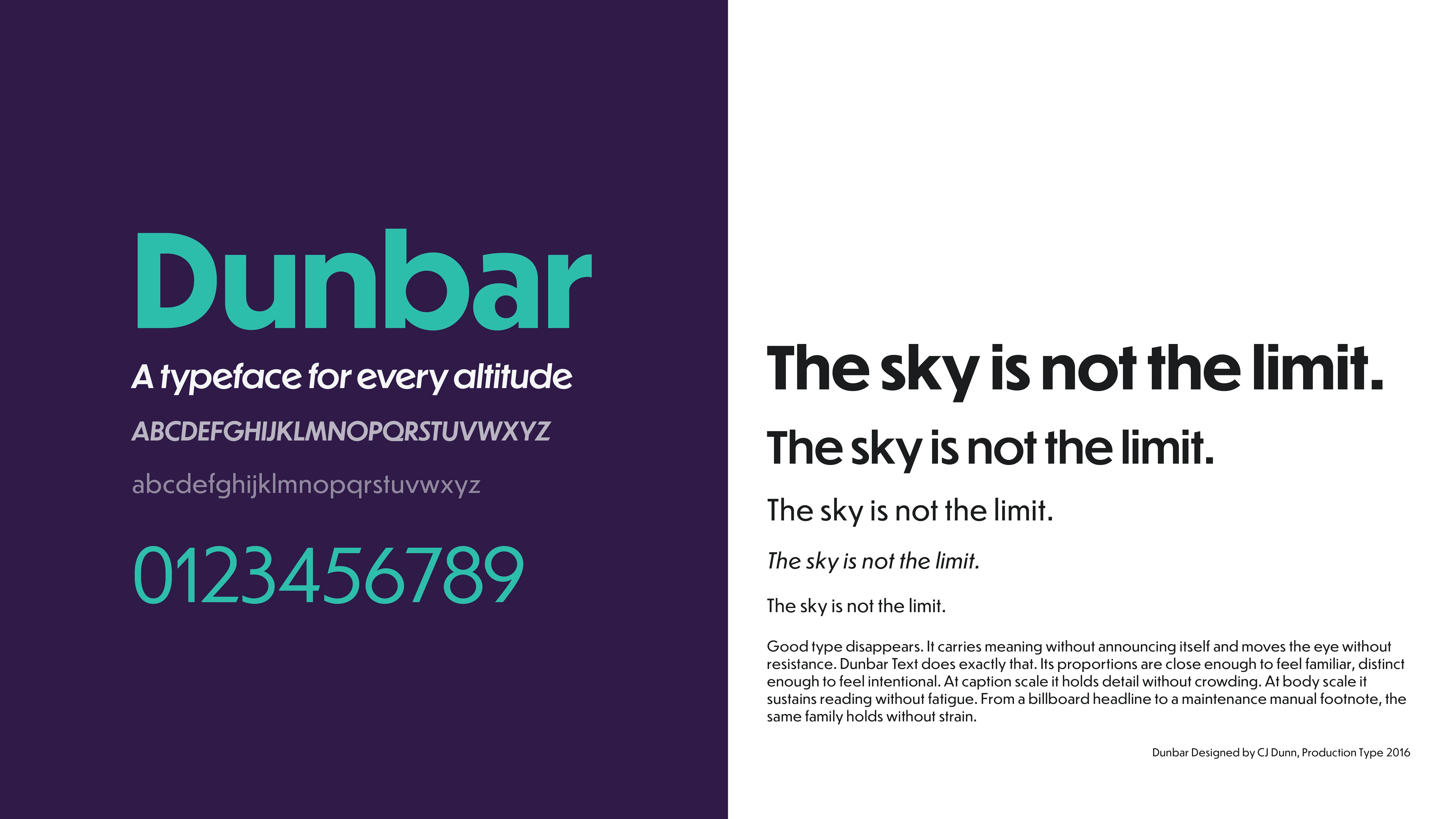
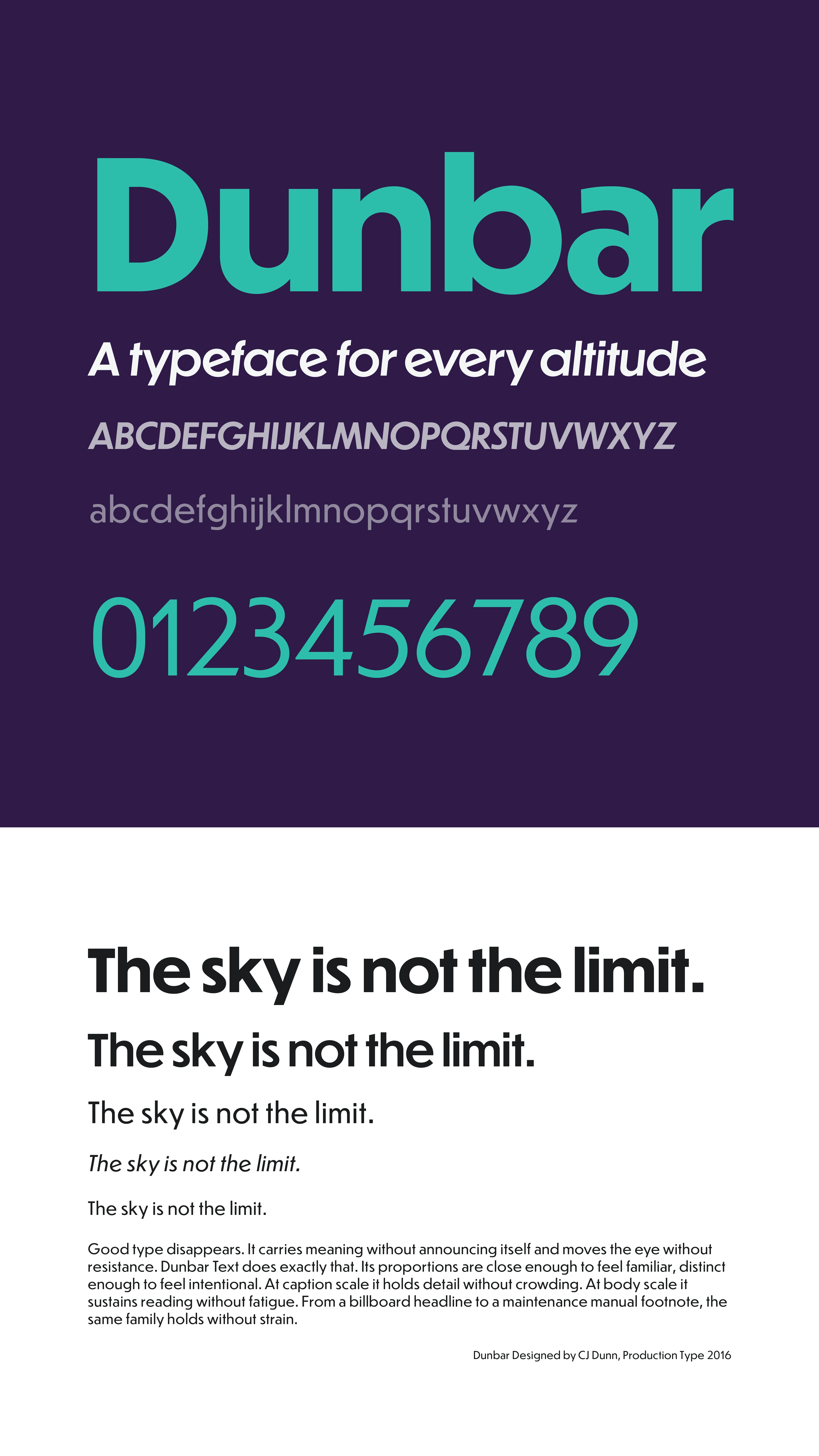
Dunbar is a geometric humanist. Precise enough for an engineering company, warm enough for one trying to rebuild trust. Its proportions feel considered rather than corporate. That distinction matters for Boeing.
Dunbar Tall carries the headlines at scale. Dunbar Text handles body copy and captions. One family, two voices, no friction between them. The system stays coherent from a billboard to a footnote.
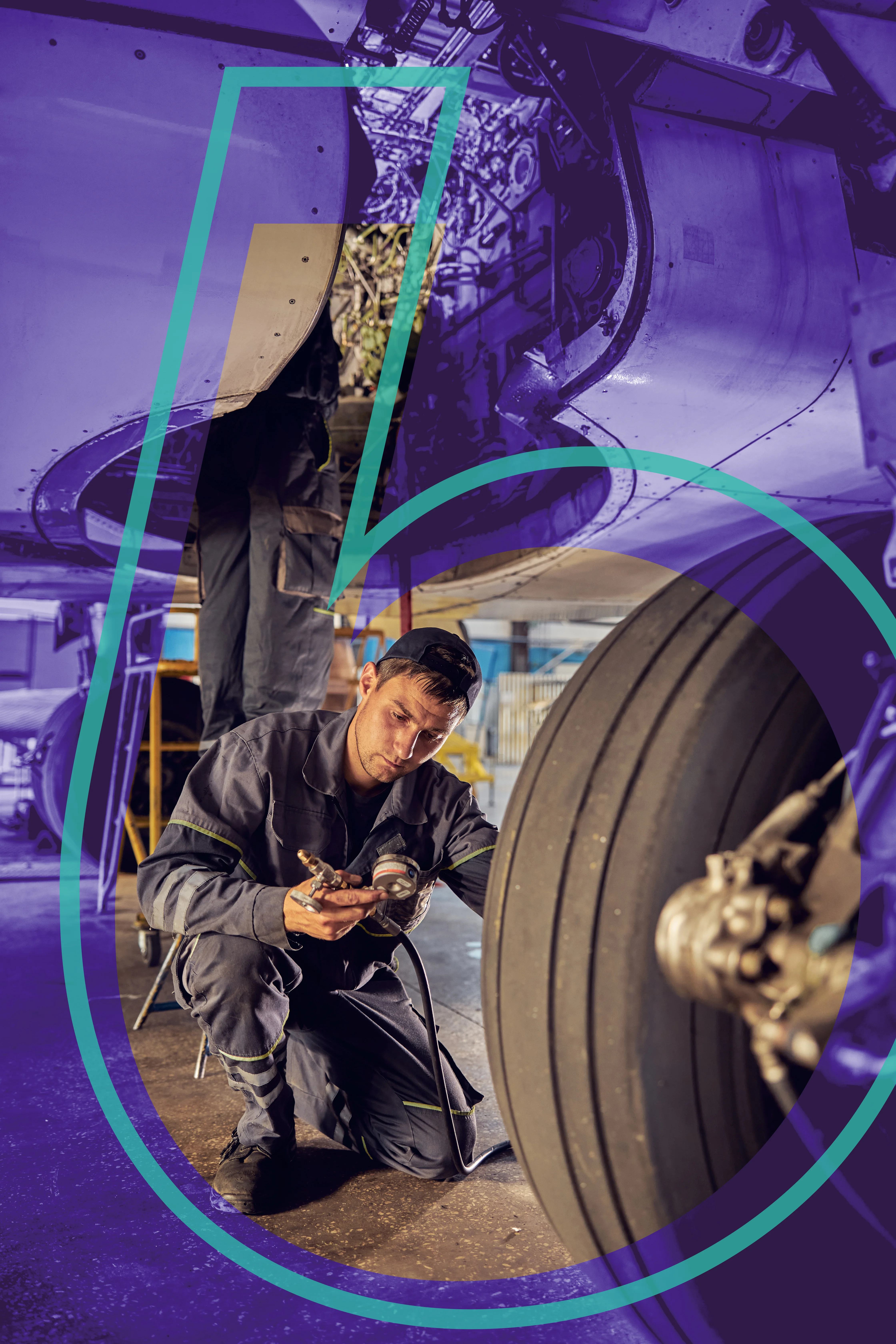
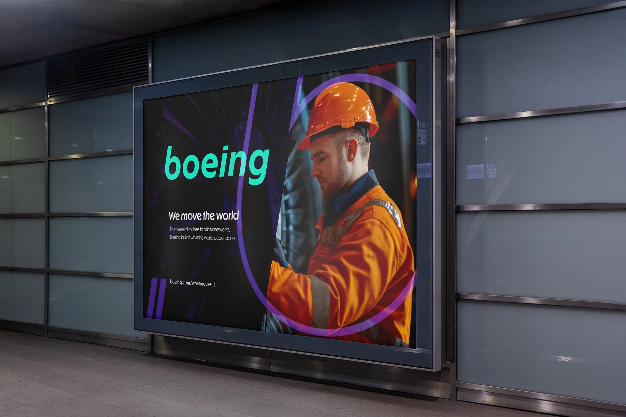
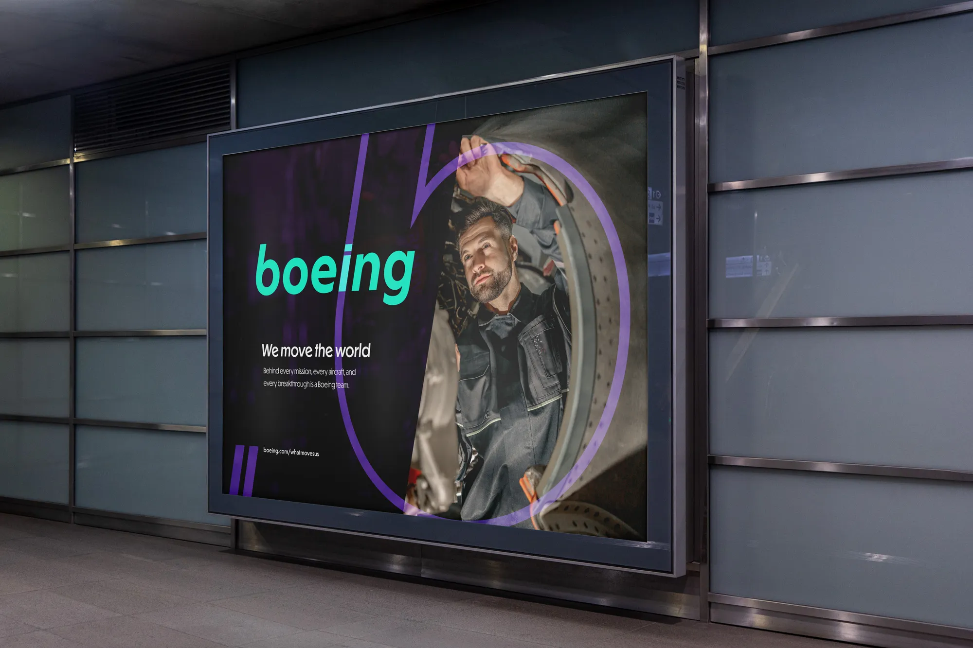
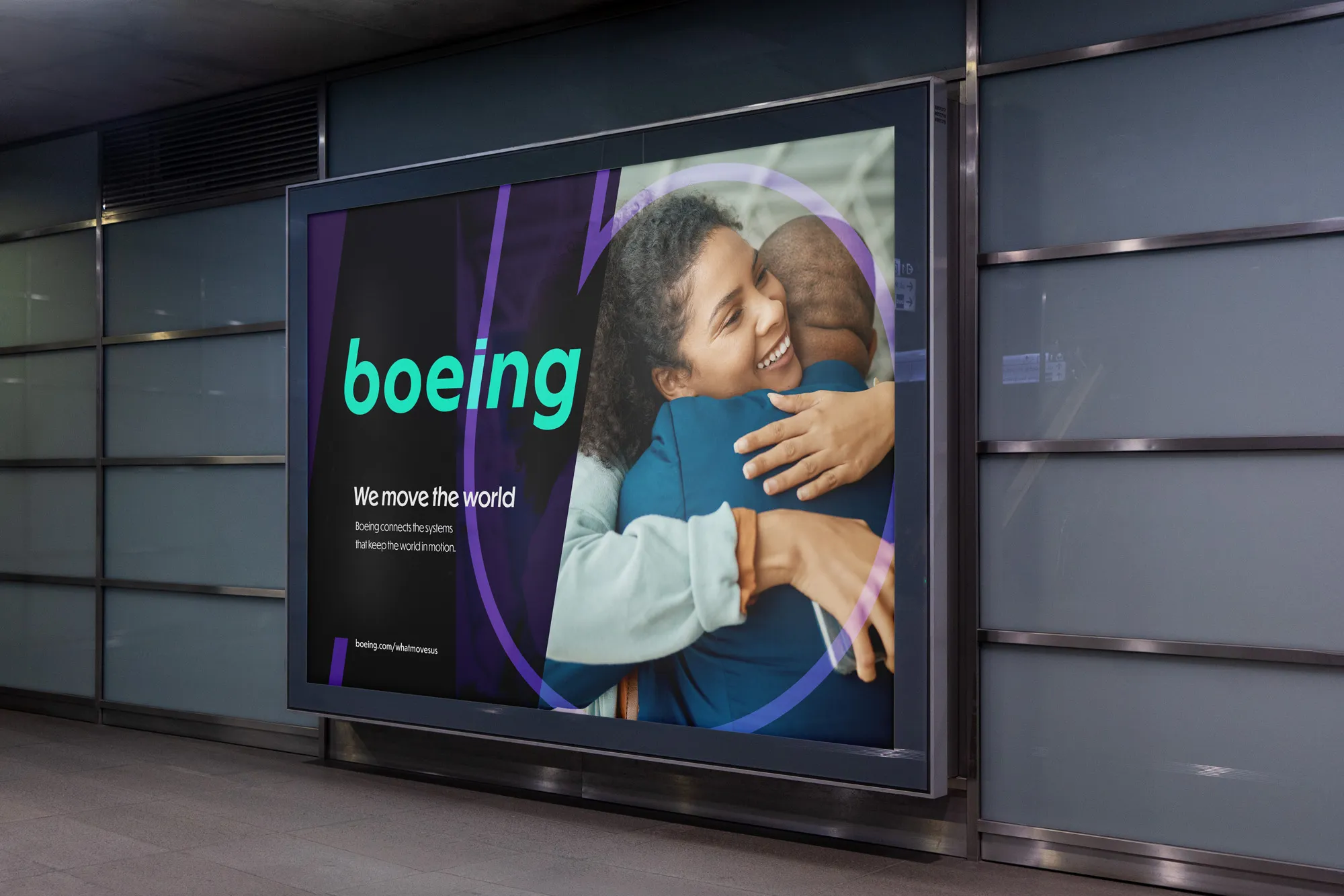
The 'b' mark does two things. As a frame, it places Boeing's people and work at the centre of the brand. Not the aircraft, not the hardware. The humans behind it. As a punchout, it cuts through the mark entirely, letting what Boeing builds speak without the brand getting in the way.

A single element used everywhere.
Every element in the system shares a single angle. The same 12-degree sheer diagonal that runs through the wordmark becomes the organizing line of the graphic system.

Every image in this campaign features real people.
Not renders. Not stock photography. Faces with context, stories with weight. The mechanic who signs off on the landing gear.
The family at arrivals.
The inspector on the tarmac at 4am.
Boeing moves the world because people make it move.
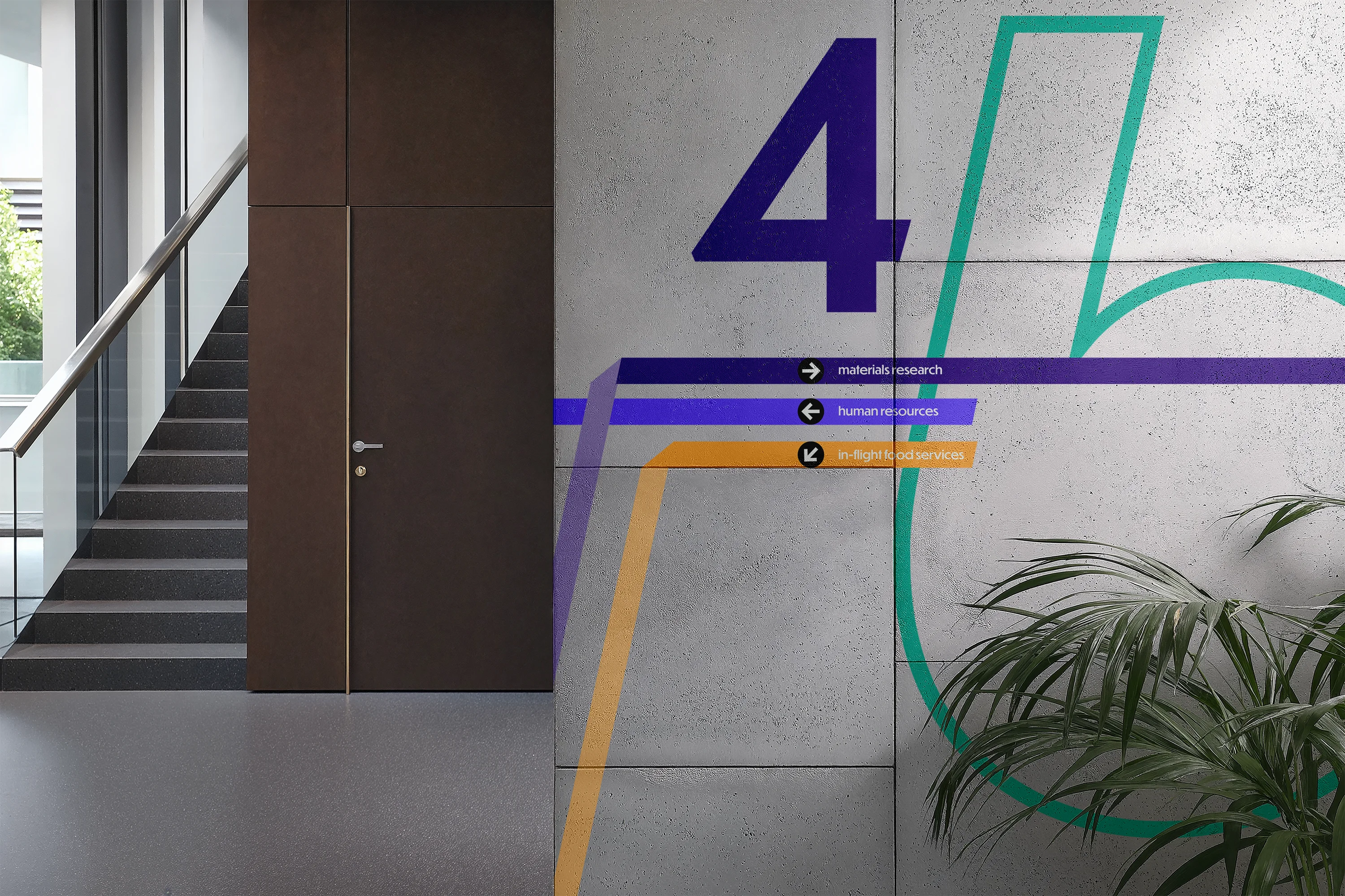
Inspired by Massimo Vignelli's approach to systems-based environmental design, this wayfinding system is built to scale. Boeing operates hundreds of facilities across dozens of countries.
The system needed to be universally legible while flexible enough to adapt to every context. From factory floors in Everett to executive campuses in Arlington.
The Climb angle runs through the signage architecture, carrying the same diagonal that organises the broader identity into the physical environment.
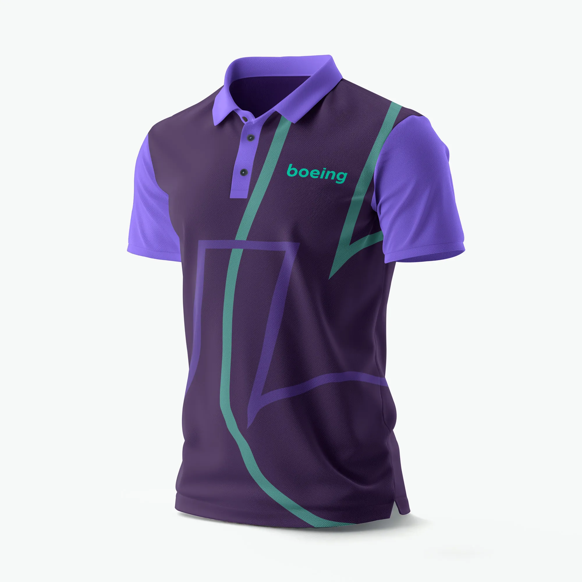
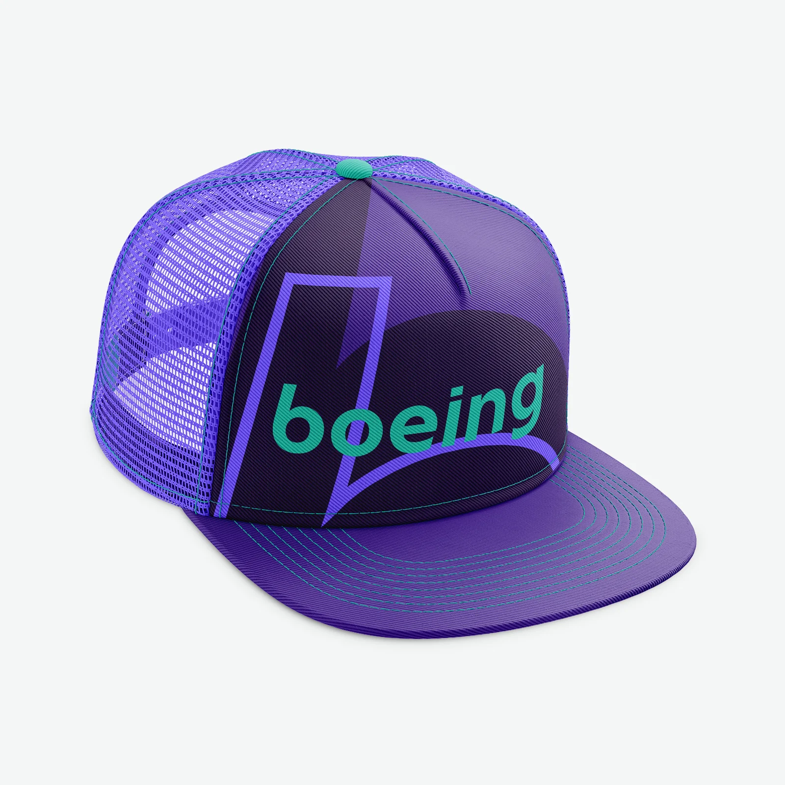
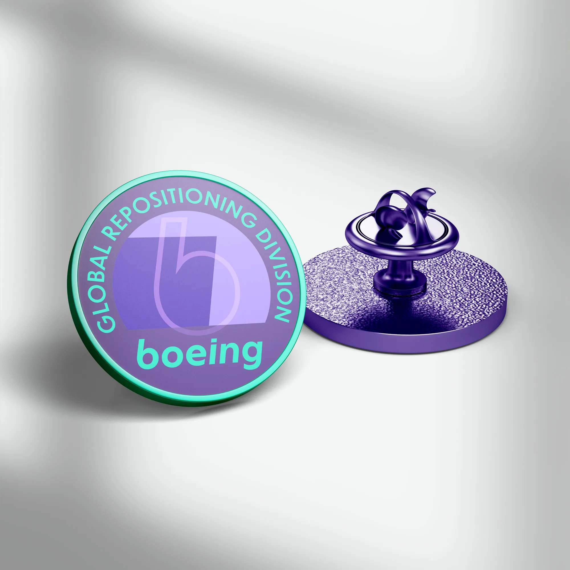
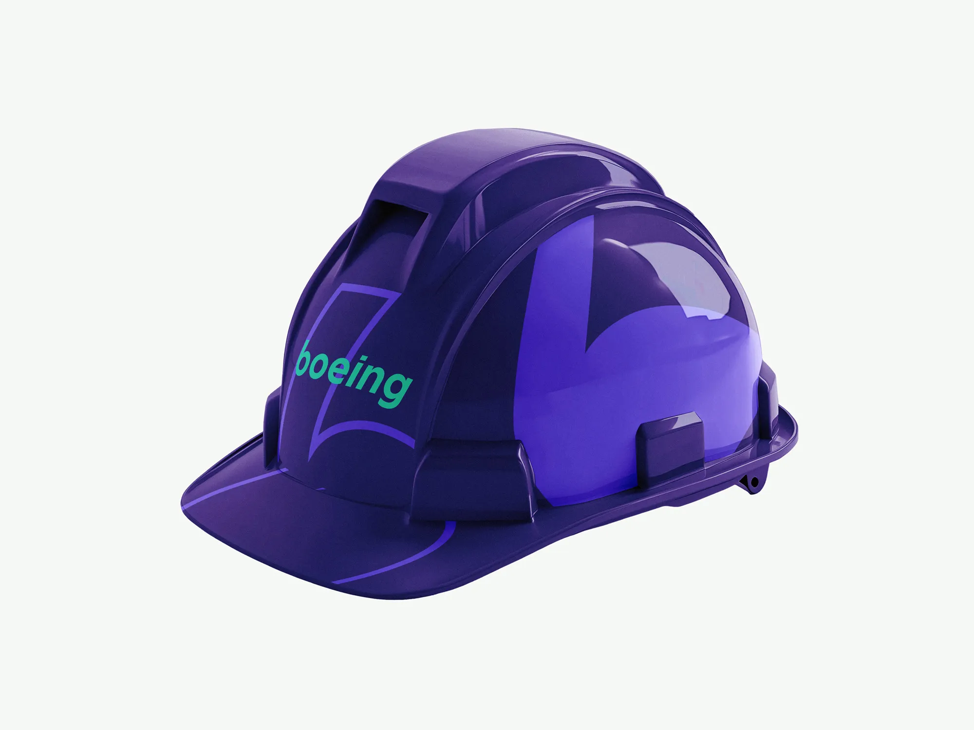
The identity extends to the people who represent Boeing every day. Polos, hard hats, pins, and headwear carry the full colour system and the 'b' mark into the physical world.
The brand lives on the people doing the work and stops being a logo.
The identity system translates directly to screen. The teal nav, the 'b' punchout in the hero, the Climb angle splitting the layout. Every element on the page is doing system work.
WhatMovesUs lives as a primary nav item: a direct invitation inside the human aspect of Boeing.

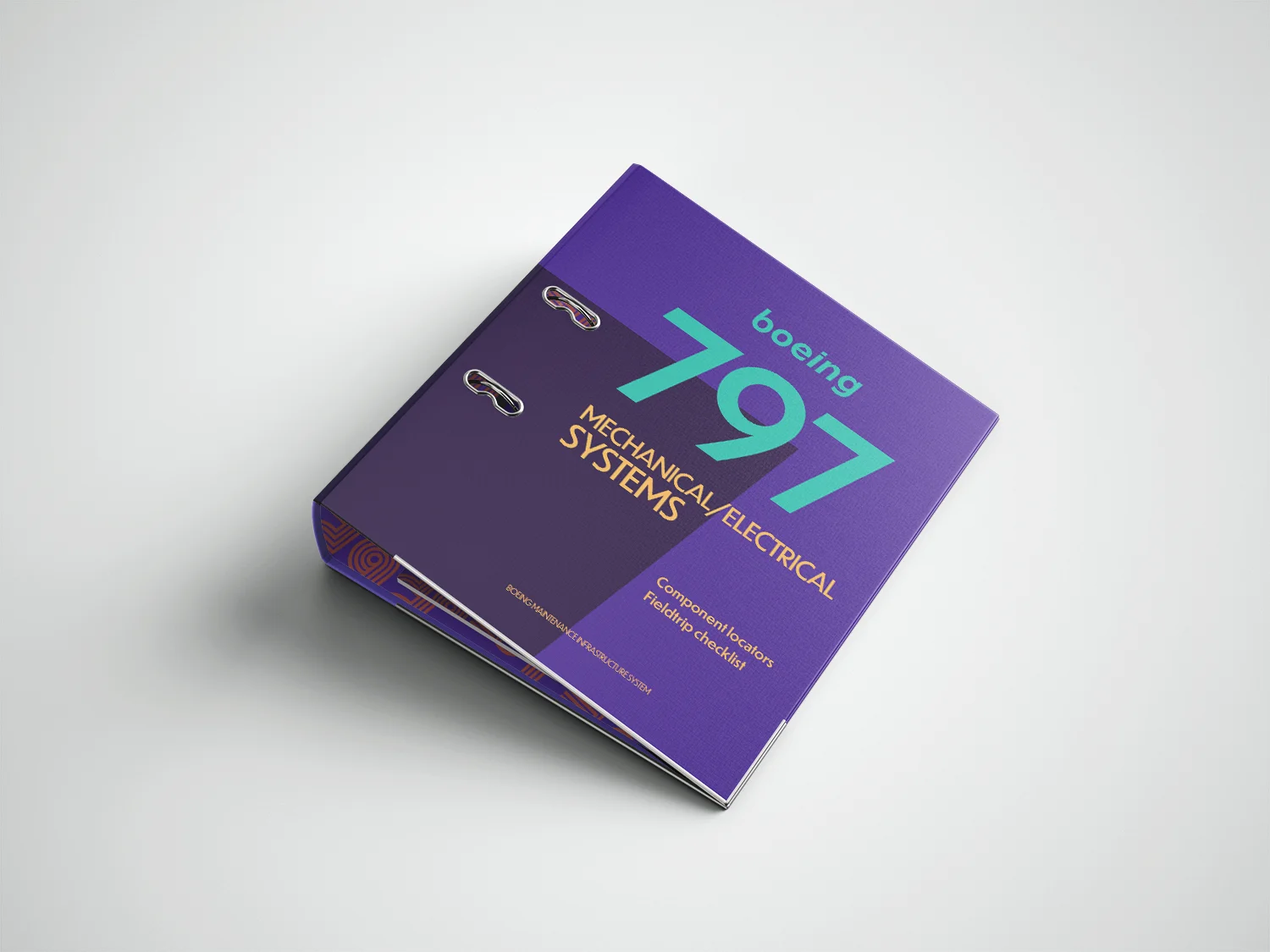
The identity system extends to Boeing's technical documentation. The 797 Mechanical and Electrical Systems manual applies the full palette, Dunbar typography, and the Climb angle to materials that engineers and inspectors rely on every day.
Every competitor uses blue.
Measured across two groups. A broad poll of 300 Americans established a baseline. A focus group of 35 participants was surveyed before the rebrand, then again 90 days after being presented with the new identity. Trust in Boeing as a brand shifted by 64 points between the two sessions.
Design cannot fix what happened. But it can signal that something has changed.