Clip-art logos. Stock photography. The same primary-color palette recycled for decades.
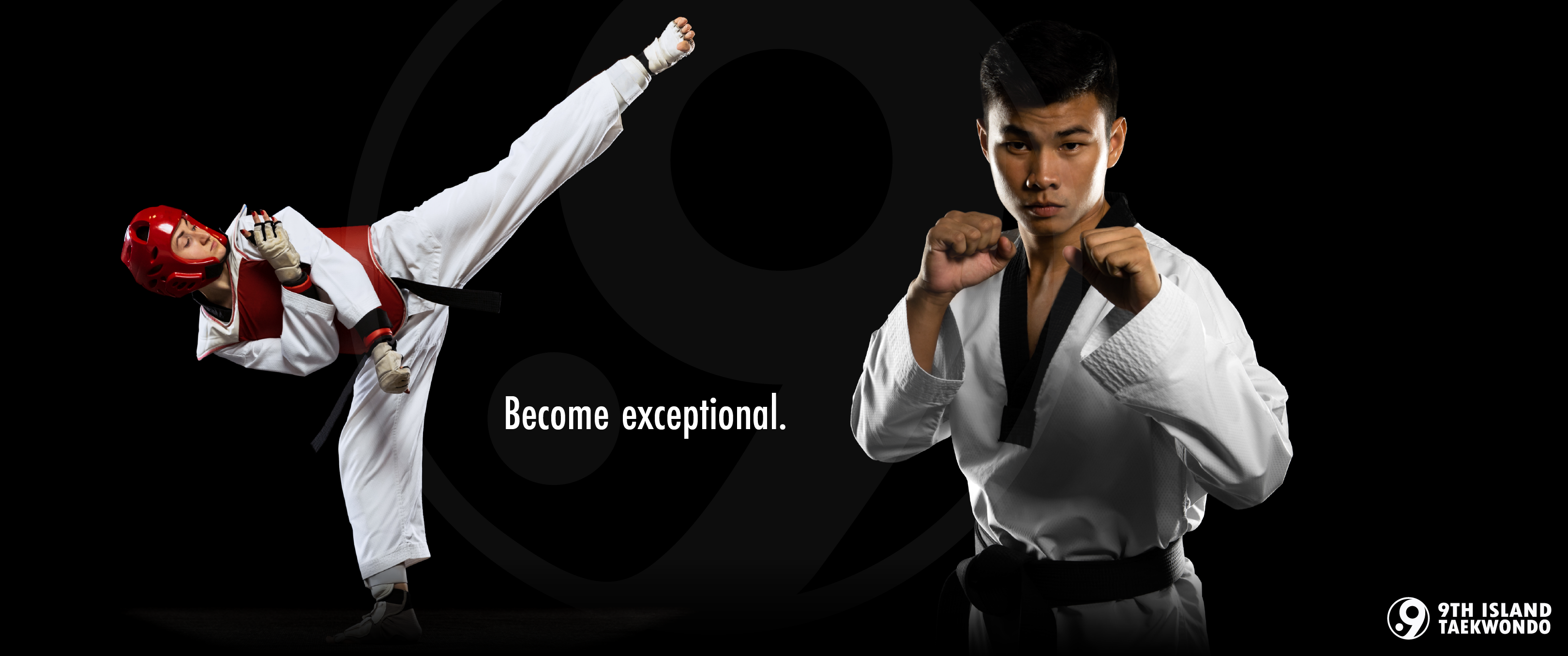
Master Jaysen Ishida was opening 9th Island with 30 years of experience, national titles, international medals, and a direct connection to USA National — credentials no competitor in the market could touch.
None of that was visible from the outside.
A new studio with no brand equity was indistinguishable from the belt factories it was built to replace. The grand opening was already on the calendar. There was no time to iterate.
Master Ishida grew up in Hawaii, started training at four years old, and spent the next three decades becoming a national champion, international medalist, and USA National team member.
Three things shaped every decision that followed:
Trust is the baseline requirement
The belt factory problem is real. Parents in Henderson have watched their kids collect colored fabric without earning it. Jaysen built 9th Island explicitly against that model: structured progression, genuine development, no shortcuts.
The name carries weight
Hawaiians call Las Vegas home because the community follows.
The brand needed to carry that sense of belonging: elite without being exclusionary, serious without being militant.
The credential gap is the opportunity
No competitor in the Henderson market has Jaysen's experience or accolades. The brand's job was to make 30 years of expertise legible in a single glance.

The real constraint was time. Every decision had to be right the first time.
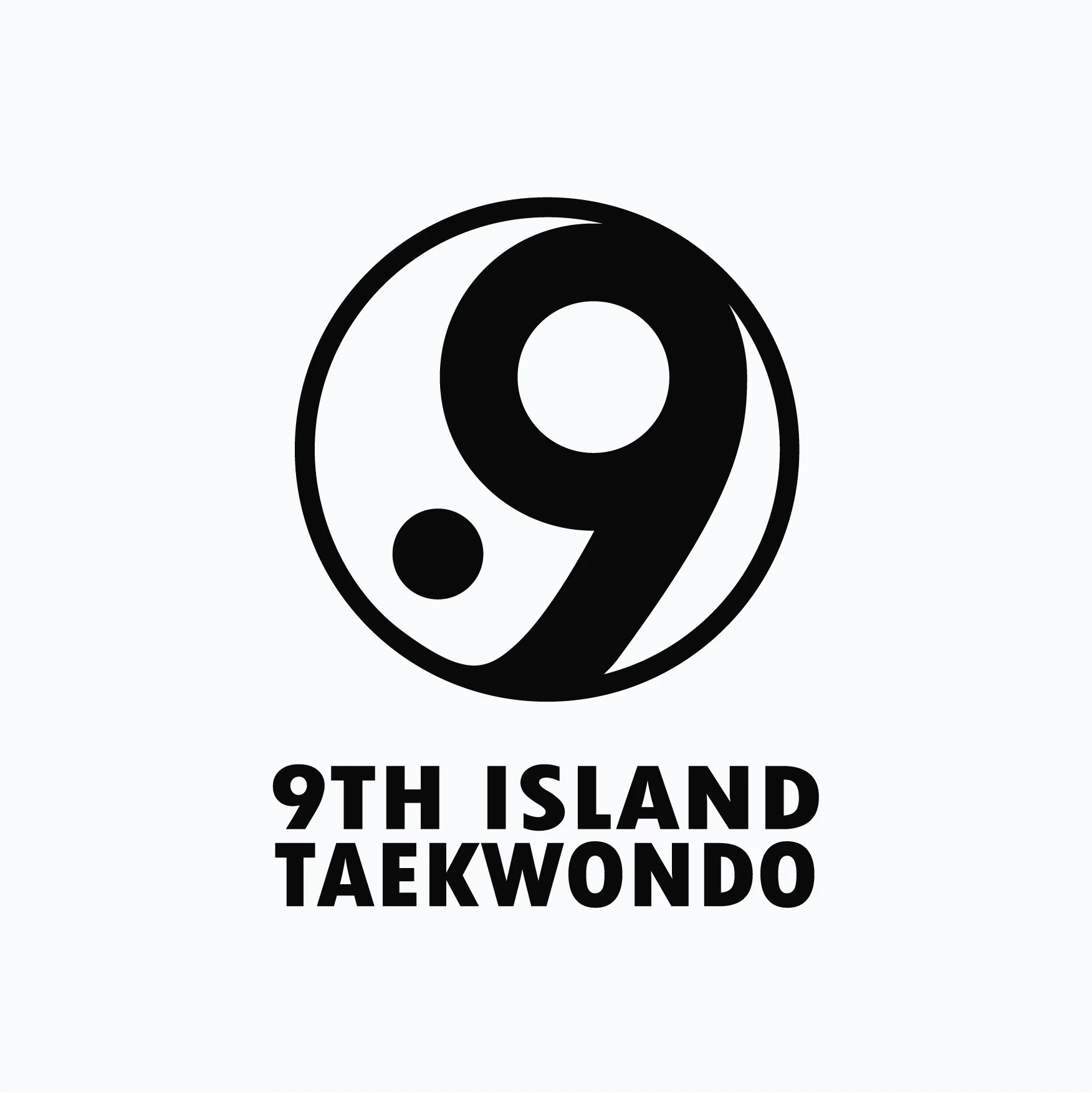
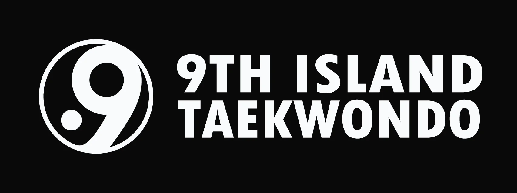
With a grand opening on the calendar and no time for a full identity exploration, we moved forward with the logo as the foundation of the rest of the identity.
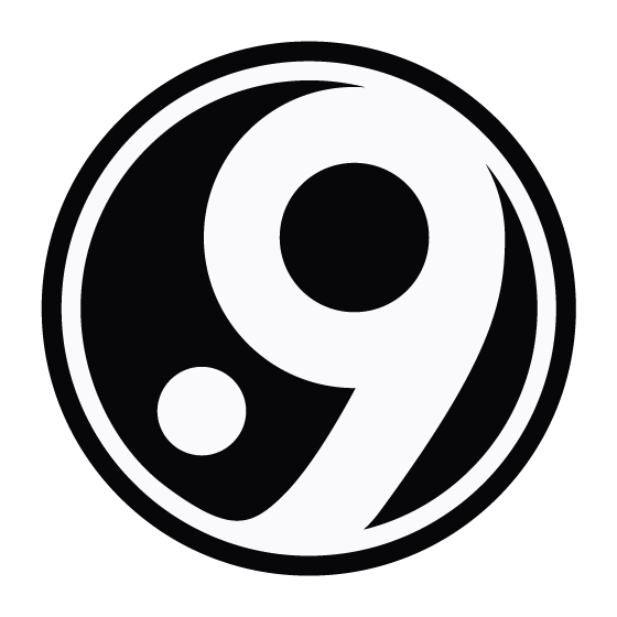
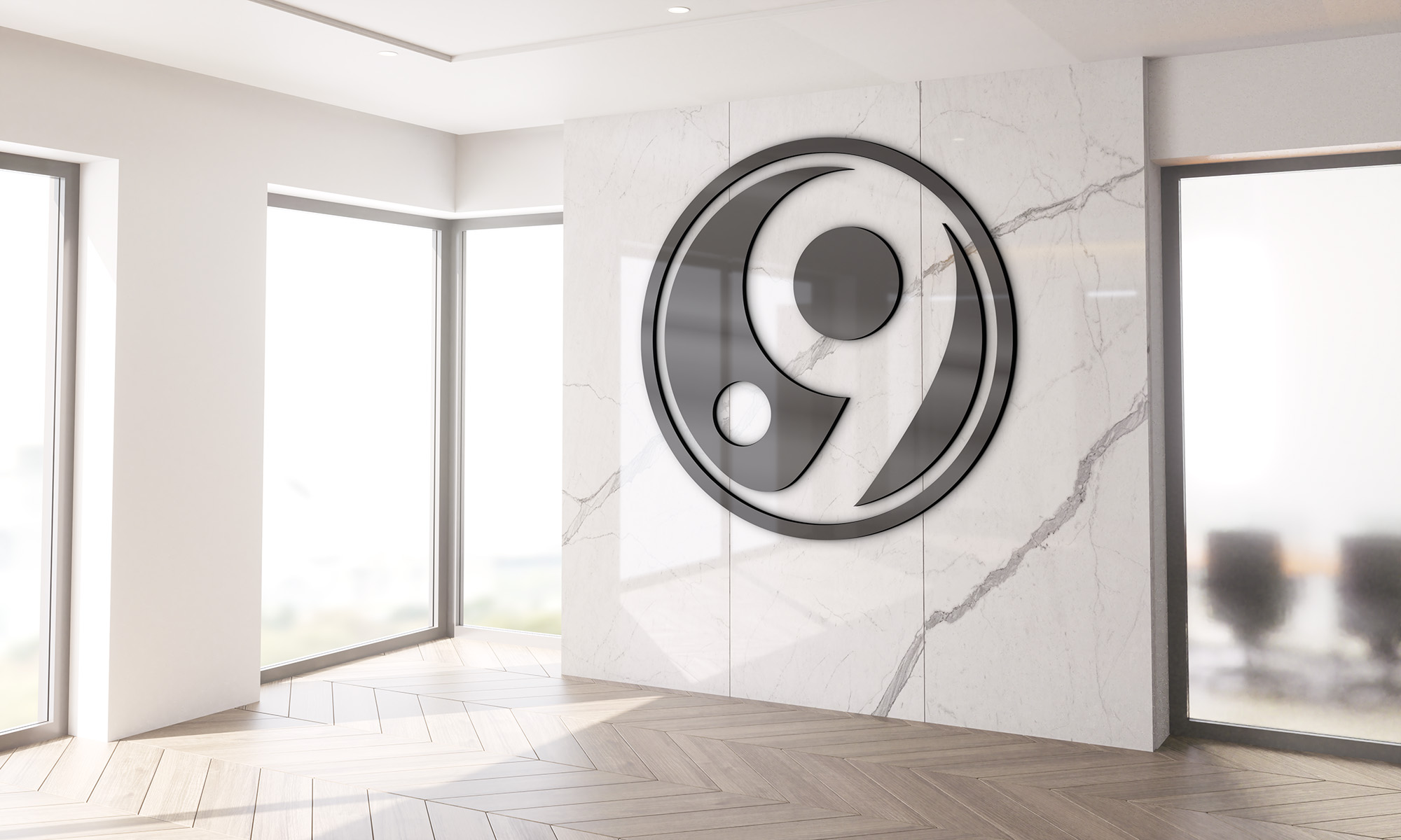
The 9 is the foundation of the entire system. Even though the white and black counters feel isolated and separated, they are surrounded by the greater community that 9th Island Taekwondo represents
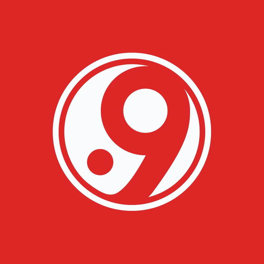
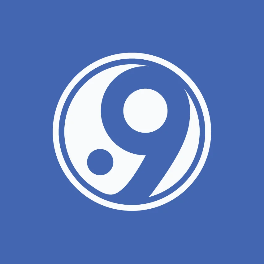
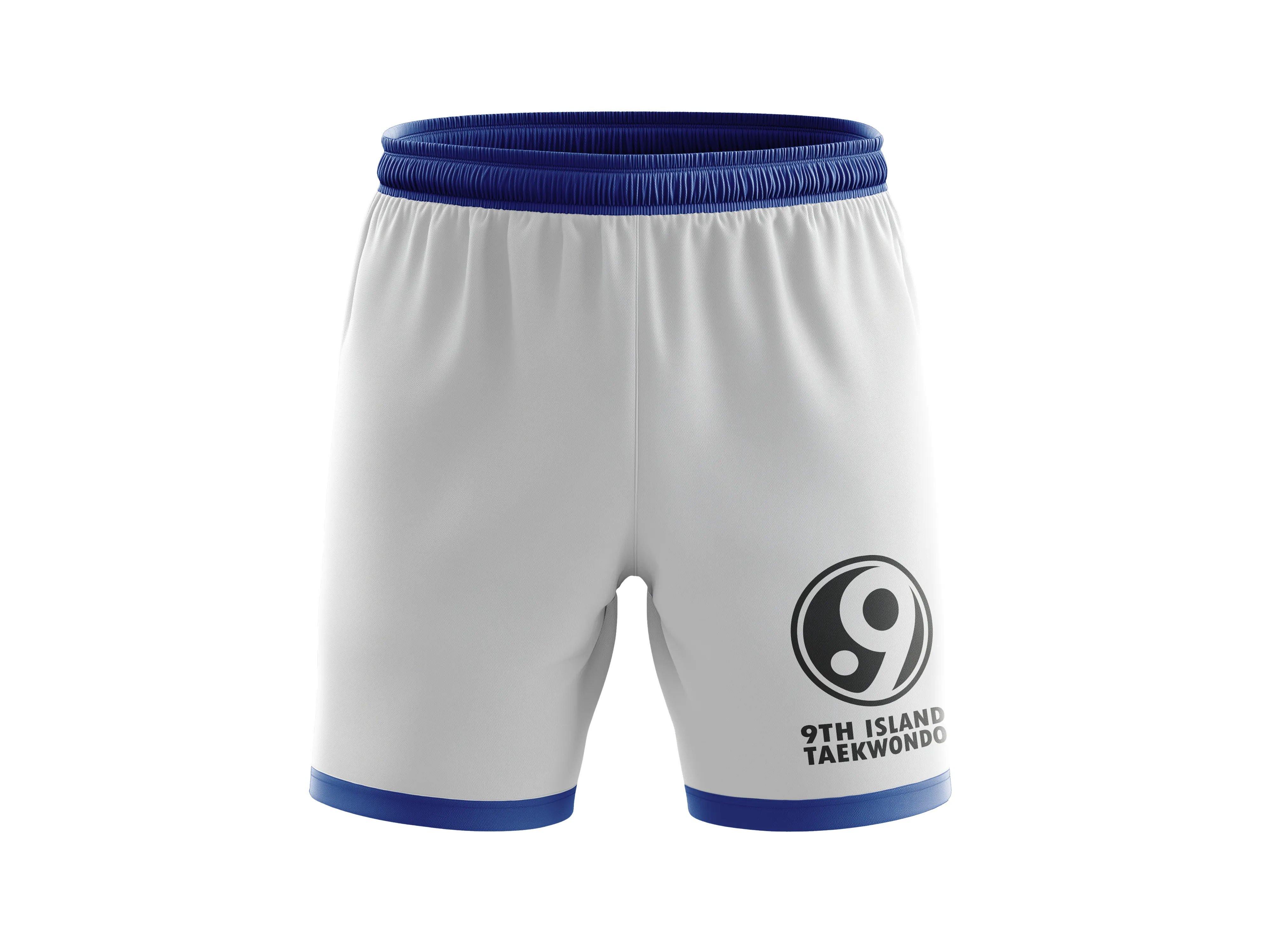
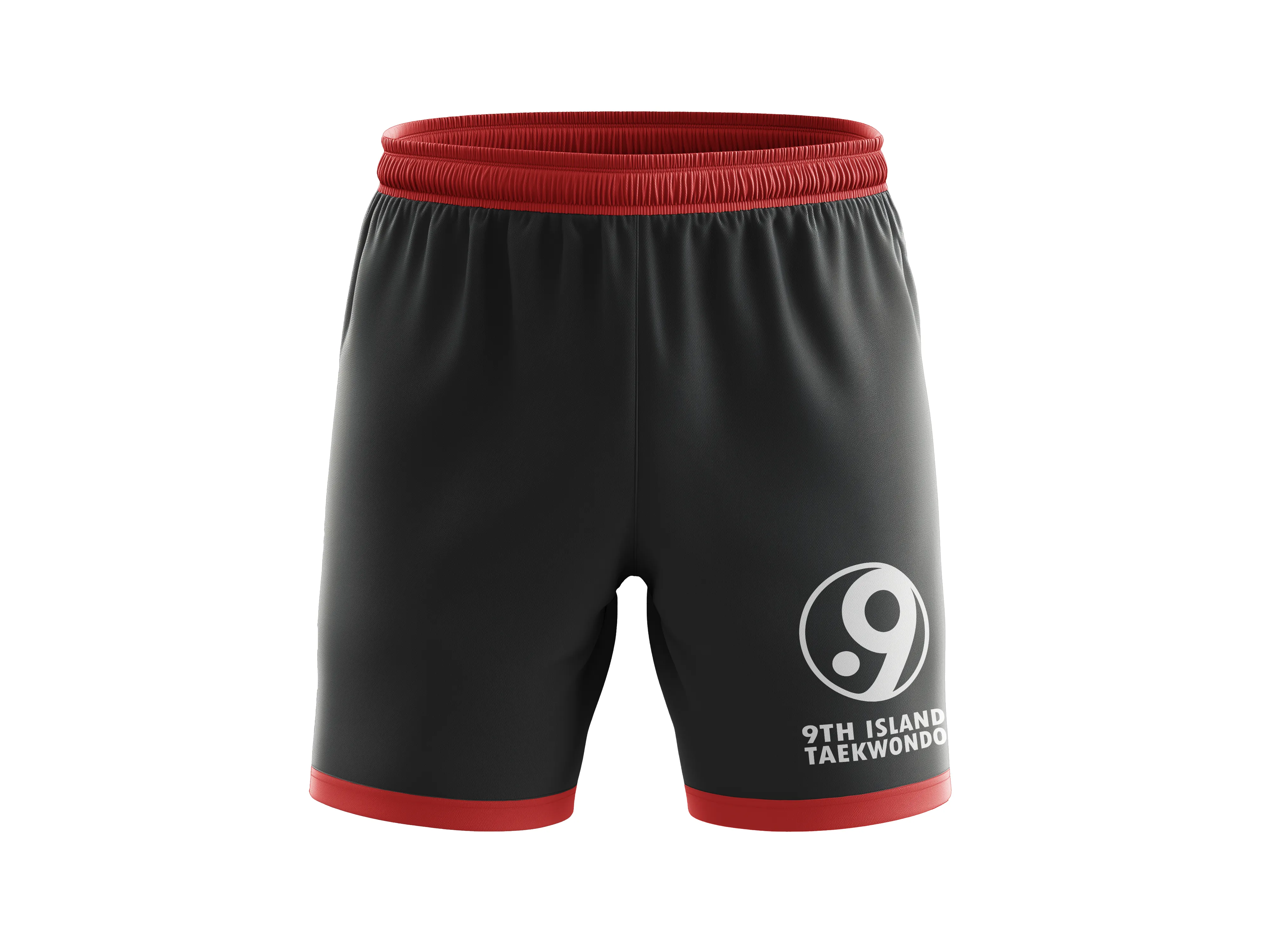
9th island shared the red-blue mat combination isn't just equipment: it's the emotional vocabulary of the sport.
Dan Black: the anchor.
Baek White: room to breathe.
Kyok Red: attack and energy.
Soom Blue: control and the reset.
Dan Black
Baek White
Kyok Red
Soom Blue
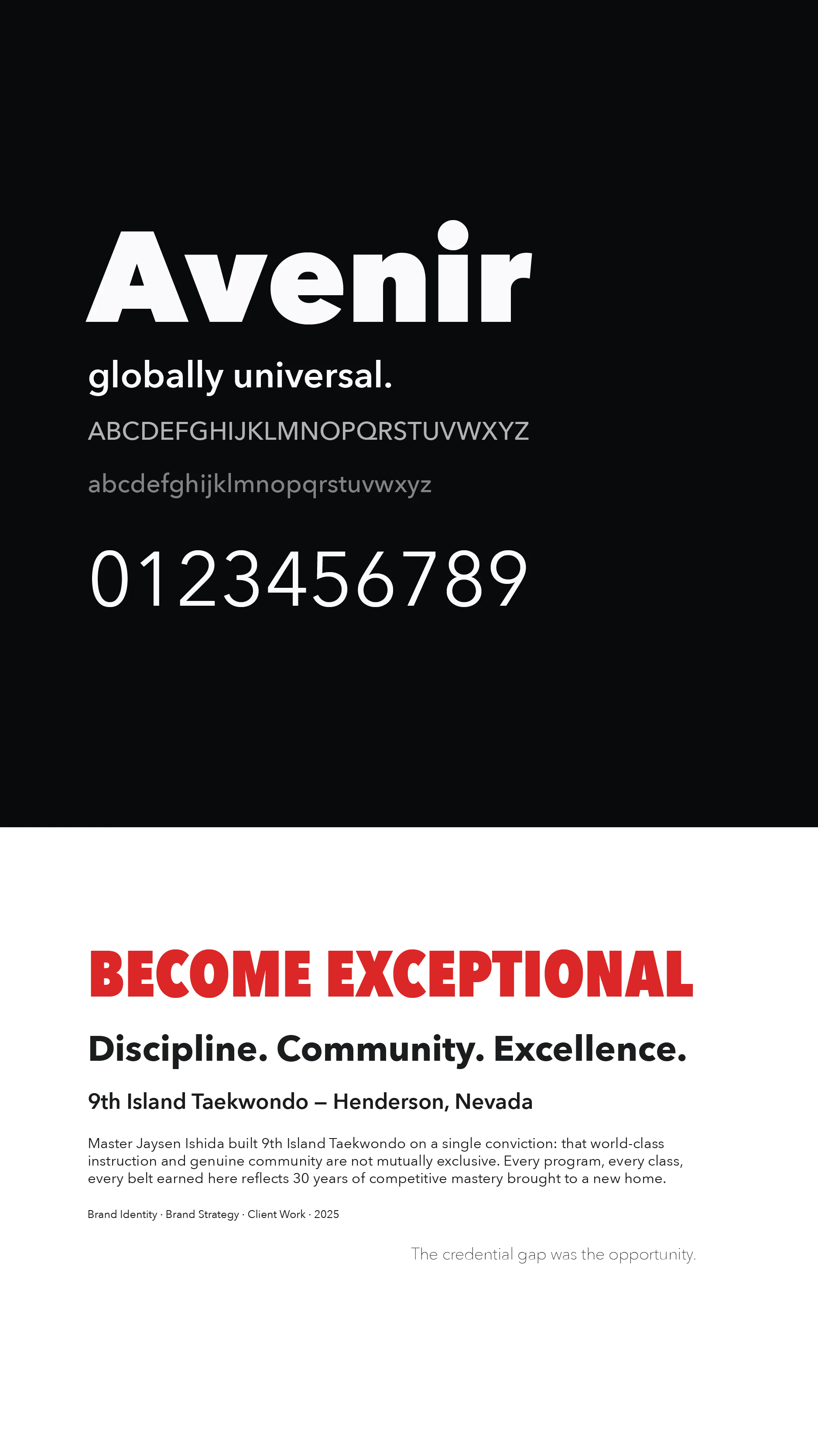
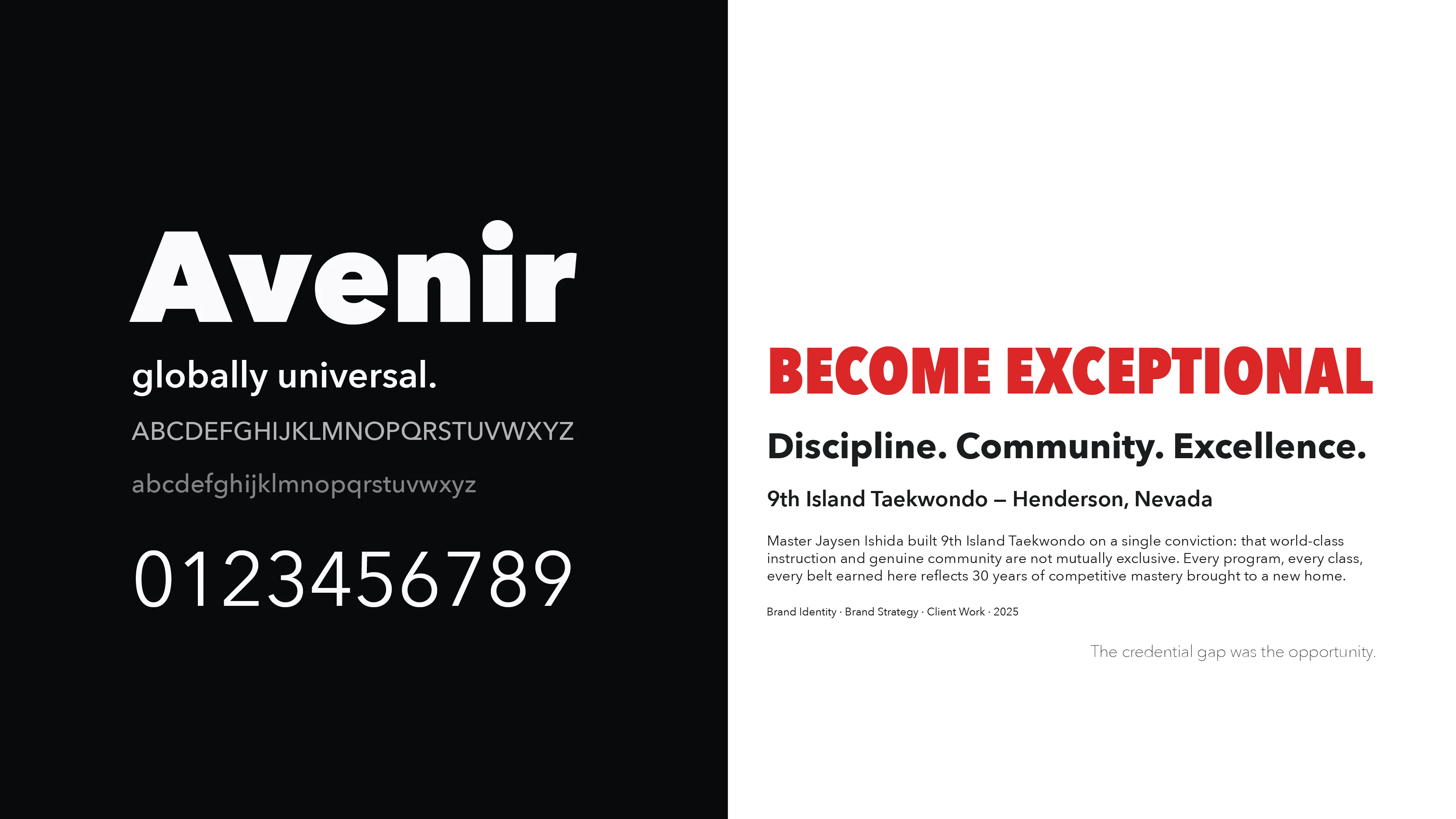
Geometric, precise, legible.
The Nike adjacency wasn't accidental; Jaysen named them as a major influence. Avenir is clean without being cold, bold without being aggressive.
Get them to the trial: it's all about getting visitors to the main conversion point of the site.
64% of site visitors arrive from the 9th Island Facebook page, on mobile.
Mobile-first, because that's where their audience is mostly found.

At scale, the 9 is immediately recognizable without the wordmark.
Signage built around the icon only — no name required.

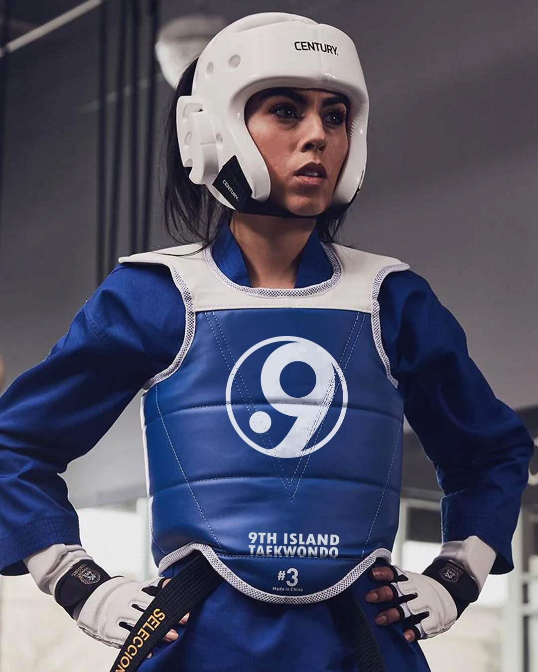
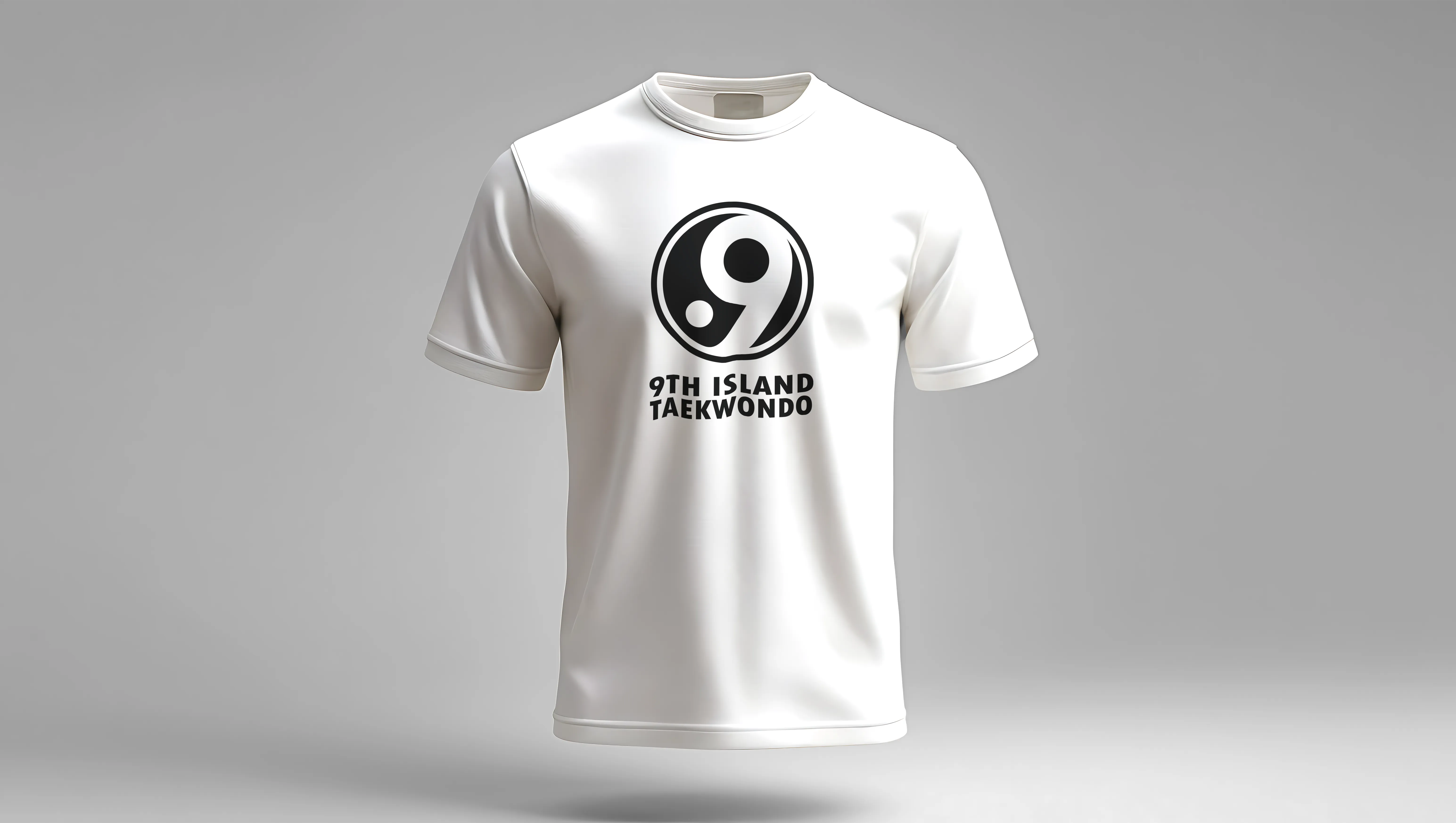
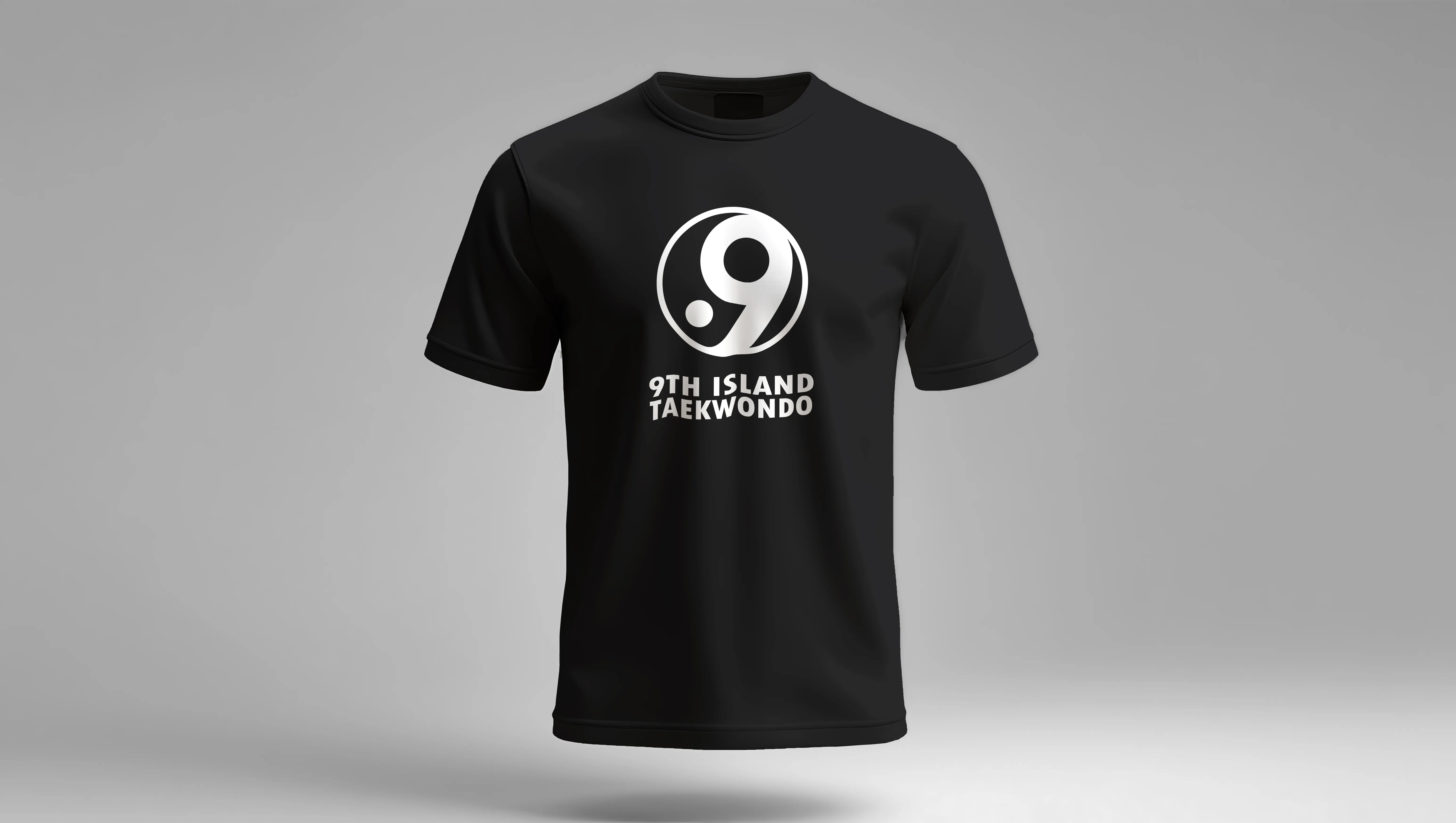
When a student wears a 9th Island shirt outside the gym, they're telling the community something about themselves.
Sparring equipment, signage, and apparel all carry the same mark.
With a grand opening already on the calendar, having a complete identity system ready before the doors opened meant 9th Island walked in with credibility from day one. The brand did its job immediately. Within 9 weeks of launch the studio had enrolled over 100 new clients, and grew its Instagram following by 300 in the first 3 weeks. In a market of belt factories and generic storefronts, 9th Island was immediately the most credible option in the room.

Brand and website went live before the grand opening, capturing initial interest.

Polished, professional look successfully positioned the studio as the professional in the local market.

100+ New clients within 9 weeks of launch, 300 new followers on Instagram in 3 weeks.
